Production Charting:
The DrillingInfo system supports a variety of production charting options, including single well or lease, composite (summed) production streams from up to 1000l wells or leases and multiwell or lease overlay charting where the production of up to 16 wells or leases can be plotted on the same plot, along with an optional ”time zero” function which time zeros the start time of multiple production streams for comparative production behavior. To access a production chart for a single well, merely click on a production dot on a map, or alternatively, an API number on a table produced by a PRODUCTION SEARCH. For other types of searches, a well or lease production chart is accessed under the ”related filings” section of the hub page first returned by clicking on a permit or completion search. In the Related Filings page, the chart is accessed by clicking on the Gas or Oil Production hyperlinks.
Underneath the chart are chart display options as well as an ”Economic Calculator” which we will discuss in the following segment in this chapter.
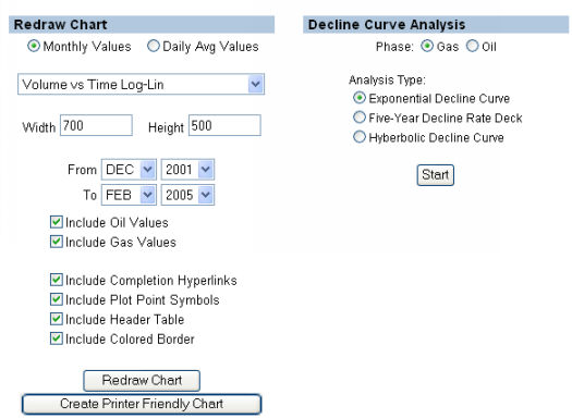
Under ”Graph Type”, a variety of options can be chosen, including:
- Rate Vs. Time Log-Lin (the first graph above);
- Rate Vs. Time Lin-Lin;
- Cum Vs. Time Log Lin;
- Cum Vs. Time Lin-Lin;
- Rate Vs. Cum, Log-Lin;
- Rate Vs. Cum, Lin-Lin.
Also, the chart can be configured to only include certain date ranges, include or exclude the oil or gas portion, include or exclude completion hyperlinks (NOTE: To zoom into a specific time range, you should EXCLUDE completion hyperlinks), Include plot points, or alternatively, create just a line, include or exclude the header, and include or exclude the Colored Border. Additionally, the chart can be made any size or shape by using the Width and Height inputs. Play around with these parameters to see how they work.
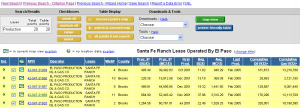
To generate a multiwell chart, first perform a PRODUCTION SEARCH. Plays or companies are popular search types for this. In our example, we have done a search for all Brigham-operated wells or leases in Texas.
Then, we look at it in table view.
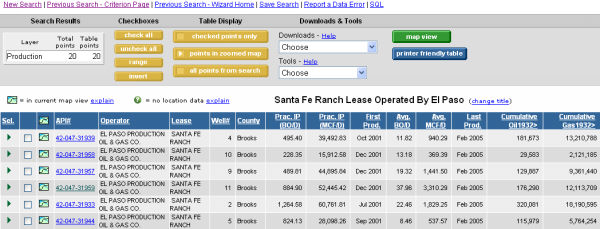
Next, we click the yellow Check All button under ”Checkboxes” (Alternatively, we can check just what we want to show&ldots;)
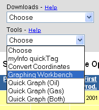
Next go to the Tools drop down menu and select Graphing Workbench.
The first chart you will see is the summed oil and the summed gas curves for all the wells selected in the Table View.
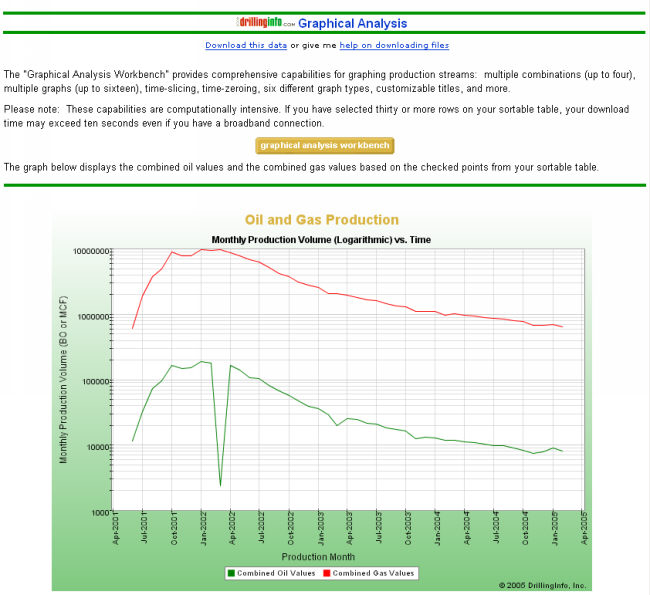
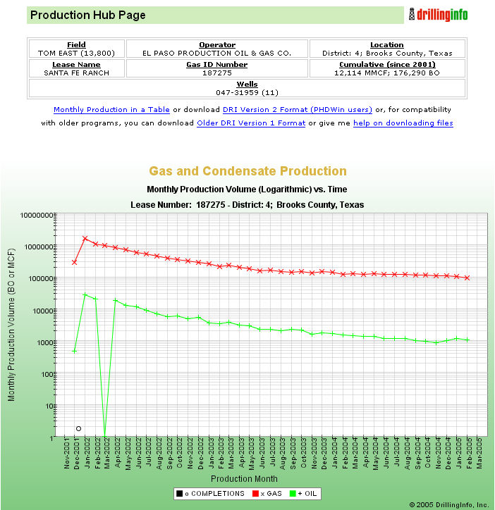
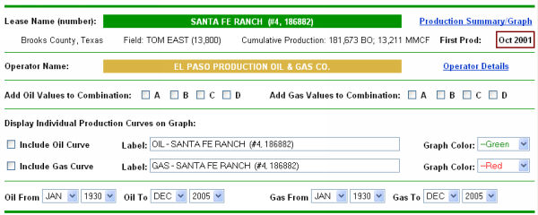
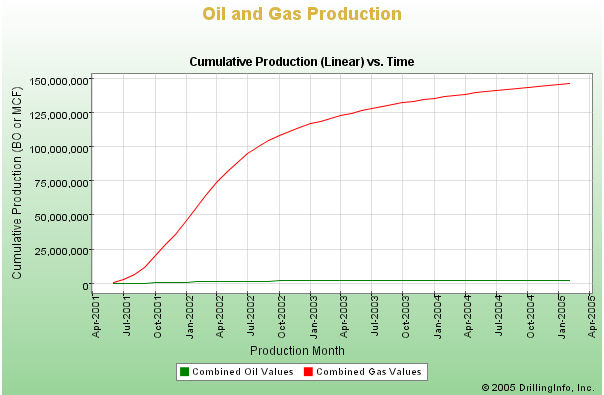
This chart is a summed Monthly Production Vs. Time Log-Lin chart of all the Santa Fe Ranch gas wells operated by El Paso Production.
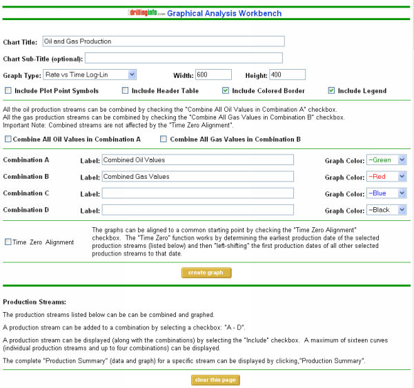
By clicking the yellow GRAPHICAL ANALYSIS WORKBENCH button, we can adjust or replot this chart in a variety of ways. A page will be generated with the following elements:
Plus a bunch of well worksheets that look like this, in the same order as the table generating this sheet&ldots;
We can generate the same types of plots that we are fond of generating for single wells. Lets take a look using the different options in the Graph Types drop down menu!
The Lin-Lin (Rate vs Time) version of the previous plot&ldots;
The Log-Lin Cum Vs Time Plot...
The Lin-Lin Cum vs Time, and more&ldots;
Now, lets play with generating multiwell plots.
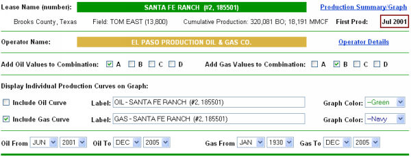
Next, we can create our own summed plots (up to 4) by clicking the ”Add Oil Values” and ”Add Gas Values to Combination” checkboxes below. If we want to plot several wells together on the same graph, we click the INCLUDE OIL CURVE or INCLUDE GAS CURVE box for each desired well, then select the color for the curve, and finally select our time frame for viewing. The default time range will be the date of first production for the earliest producing well in your selection. In the Table View I sorted the wells by Cumulative Gas production and picked out the top 3 producers. Then, in the Graphing Workbench I found these 3 wells and checked to include the gas curves for these wells in addition to the summed oil and gas production curves for all wells in the selection. In our case, we will select beginning date as June 2001 and only show GAS. (Note: The graph type selected is Rate vs Time Lin-Lin.)
Click on the CREATE GRAPH button up above the well section (as seen below)&ldots;

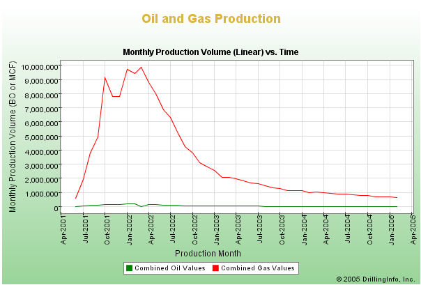
Ad we get the following graph&ldots;
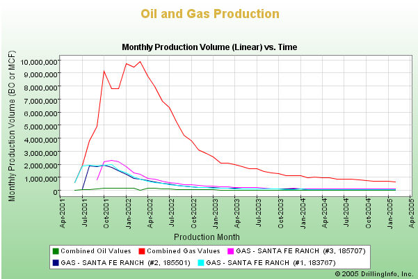
This is El Paso's Santa Fe Ranch total monthly production vs time compared to the top 3 producers in the Santa Fe Ranch lease.

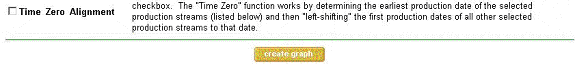
Next, lets click the CLEAR THIS PAGE button as seen above. Then, we will select the same 3 wells, change the graph type to Rate vs Time Log-Lin and select the same time frame, but we will check the TIME ZERO ALIGNMENT box.

Click CREATE GRAPH:
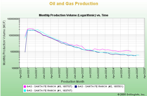
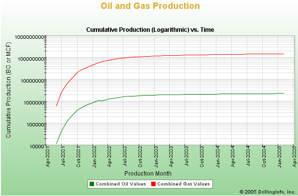
And now we have the top three gas producers on El Paso's Santa Fe Ranch lease plotted on a log-lin scale. Now you can graphically compare the decline of the three wells. The Santa Fe Ranch #1 didn't begin declining as fast as the #2 and the #3. However, the #3 came on the strongest out of these three wells.